CHA

Client
UCLA DESMA
Year
2020
Duration
10 weeks
Digital & Physical
Format
Tools
Adobe Photoshop, Illustrator, InDesign
The Challenge
I was tasked with creating a graphic design novel based off of a song. As someone who loves all sorts of music and ties my own emotions to the songs I love, I had to find what song I wanted to research. How can I communicate the themes and emotions of said song through designs created through typography?
My Role
I immersed myself into the research of the song, CHA, discovering how the song truly affects me and how much of an impact it had on me. Through heaps of sketches, critiques, and research into the band, Laundry Day, I was able to create designs within Illustrator and InDesign.
Solution:
In order to convey the emotions and memories associated to the song, I needed to truly understand the meaning of the song and how different notes, instruments, and pitches symbolize a different aspect that is tied to my own life.
Design
Research
I immediately jumped into the design process by conducting research on the band and the specific emotions the songs gave me while listening to it. I must have listened to the song close to a thousand times during this project. I began by understanding the band’s inspirations and their upbringings. As they were similar to my own age, it is much easier to understand their feelings and struggles. I also researched key words, emotions, and instruments that were in the song. By focusing on these specific words, I was able to center my designs around them.
Ideate
Sadly, all my old sketches, brainstorms, and research were lost. However, to explain my process, I ensured to utilize my research and own experiences with the song to create the rapid-sketches and more complex sketches.
Critiques
One of the key aspects in my design process that helped me develop as a designer was feedback. Each week, I made sure to create the best possible designs so that my peers and professor could critique them with no filter. Specifically, my professor’s candidness and brutal honesty helped me realize that I was not digging deep enough. By forcing myself to dig deeper by only listening to specific parts of the song, I was able to create deeper and more emotional designs.
Final Designs
Each slideshow is a separate chapter in my novel and showcases their own design restrictions and emotions. After the last slideshow, there are explanations and critical reviews for each chapter.


Critical Reviews
Chapter 1
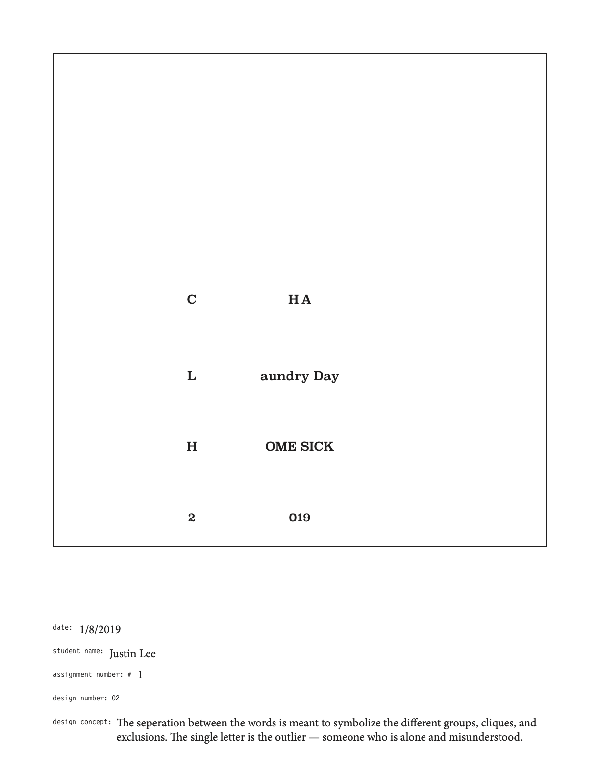
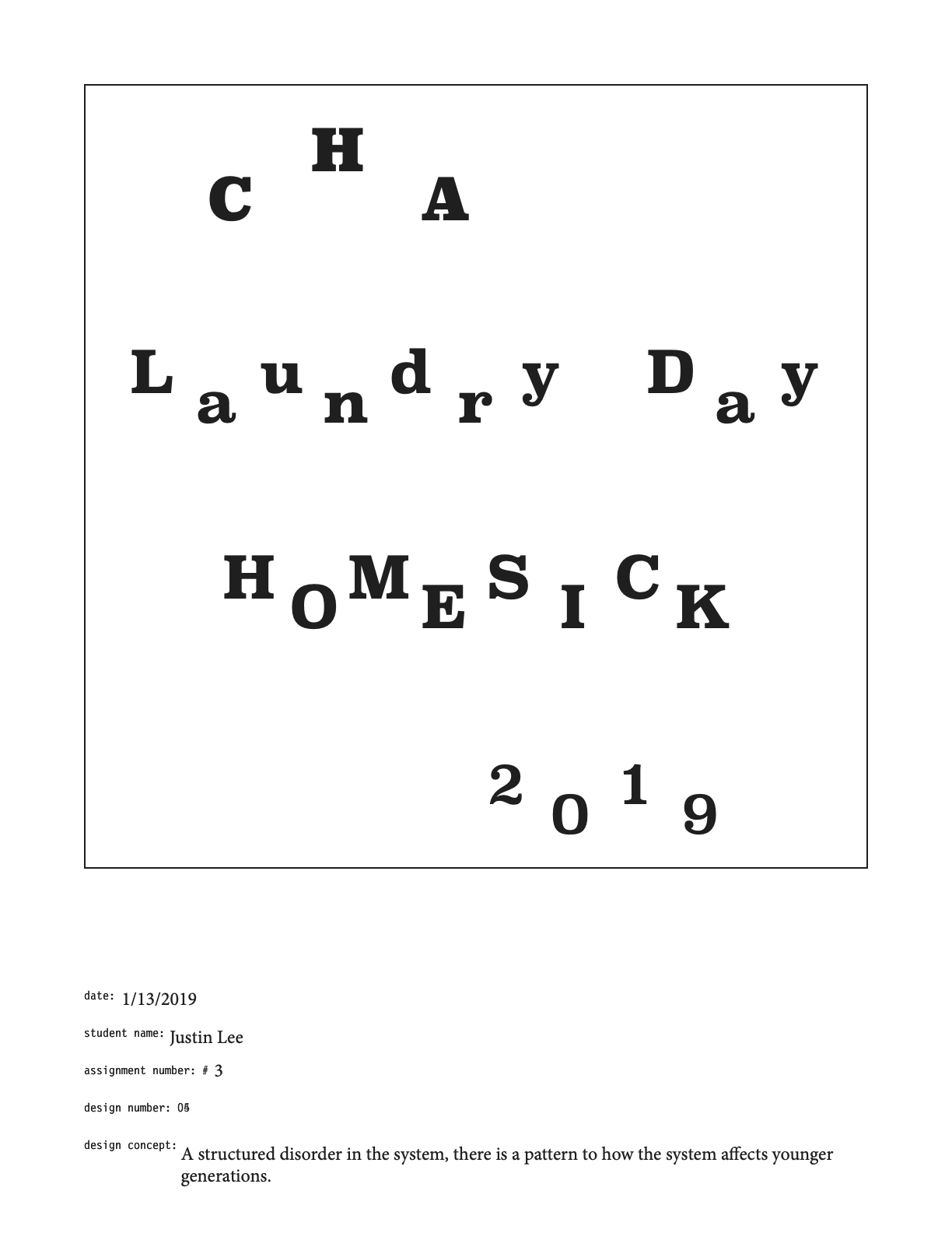
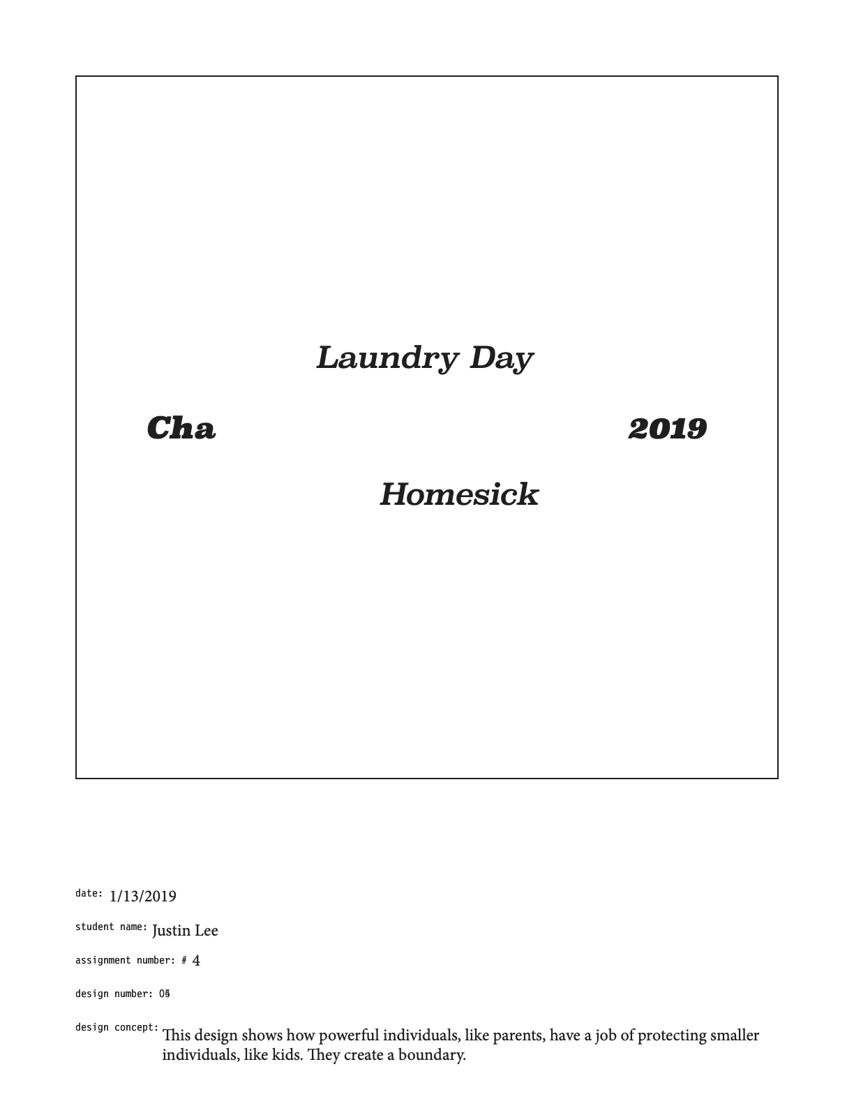
One of the hardest aspects of chapter 1 was the fact that I had various restrictions. I was not able to change the font size, typeface, or color. I had to creatively create five unique designs that catered to my song using these restrictions. I had to use Superclarendon size 12, Regular, and black. Design number 2 was my best design. There was a unique personality to the text and separation between the words, which created something new and special. However, my personal favorite was design 4. I loved the aesthetic and how the design brought forth a certain dysfunction, yet a structured pattern.
Chapter 2
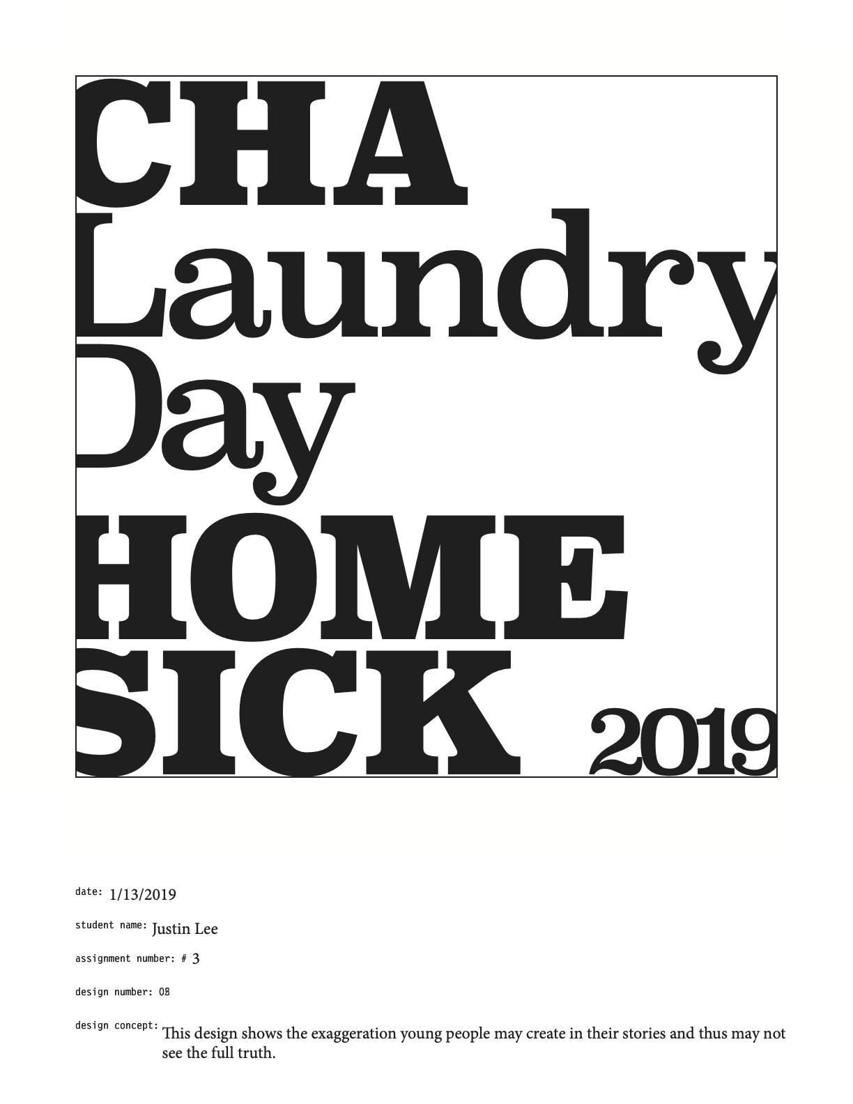
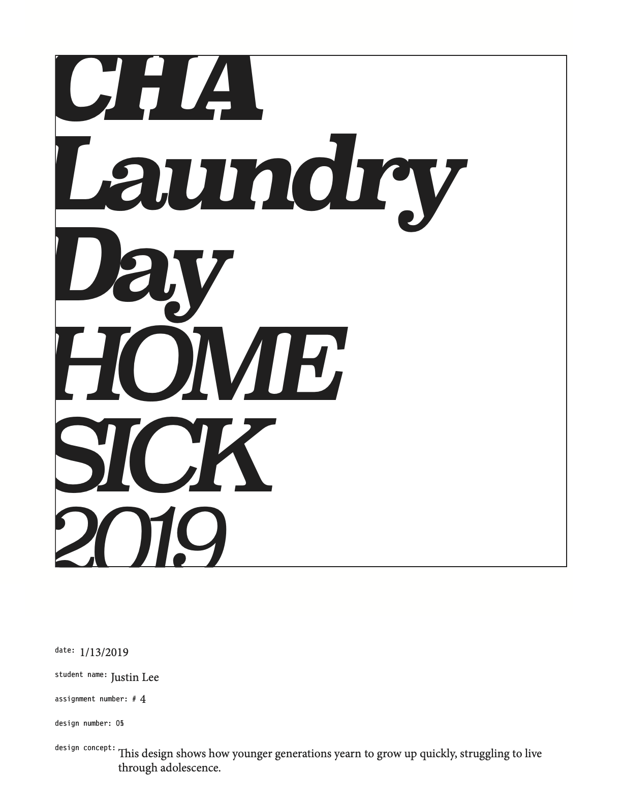
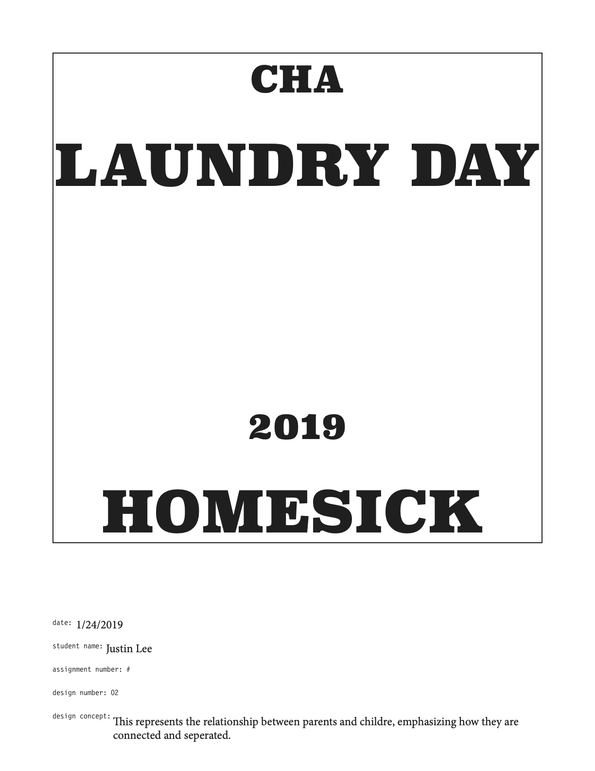
For chapter 2, I had more range with my designs. I was able to use bigger font sizes for each of my designs, but I was sill restricted to one typeface and black on white. My best design was design number 1. The design was simple, yet provoking. It had the most consistency and power compared to the other designs. Similar to assignment 1, my best design was not my favorite. Design number 2 was my favorite. To me, the design was the most unique and powerful. I personally liked how the text seemed to be broken and falling, placing more emphasis on the theme.
Chapter 3
For chapter 3, with the ability to change font sizes, I was also able to play around with light and bold typefaces. Through this, I was able to create more visible hierarchy and highlights. My best design was design number 5. The design was unique and different than any of my previous designs. It carried consistency and depth. Unlike my previous assignments, my best design was my favorite. This design went through various versions and changes before becoming what it is now.
Chapter 4
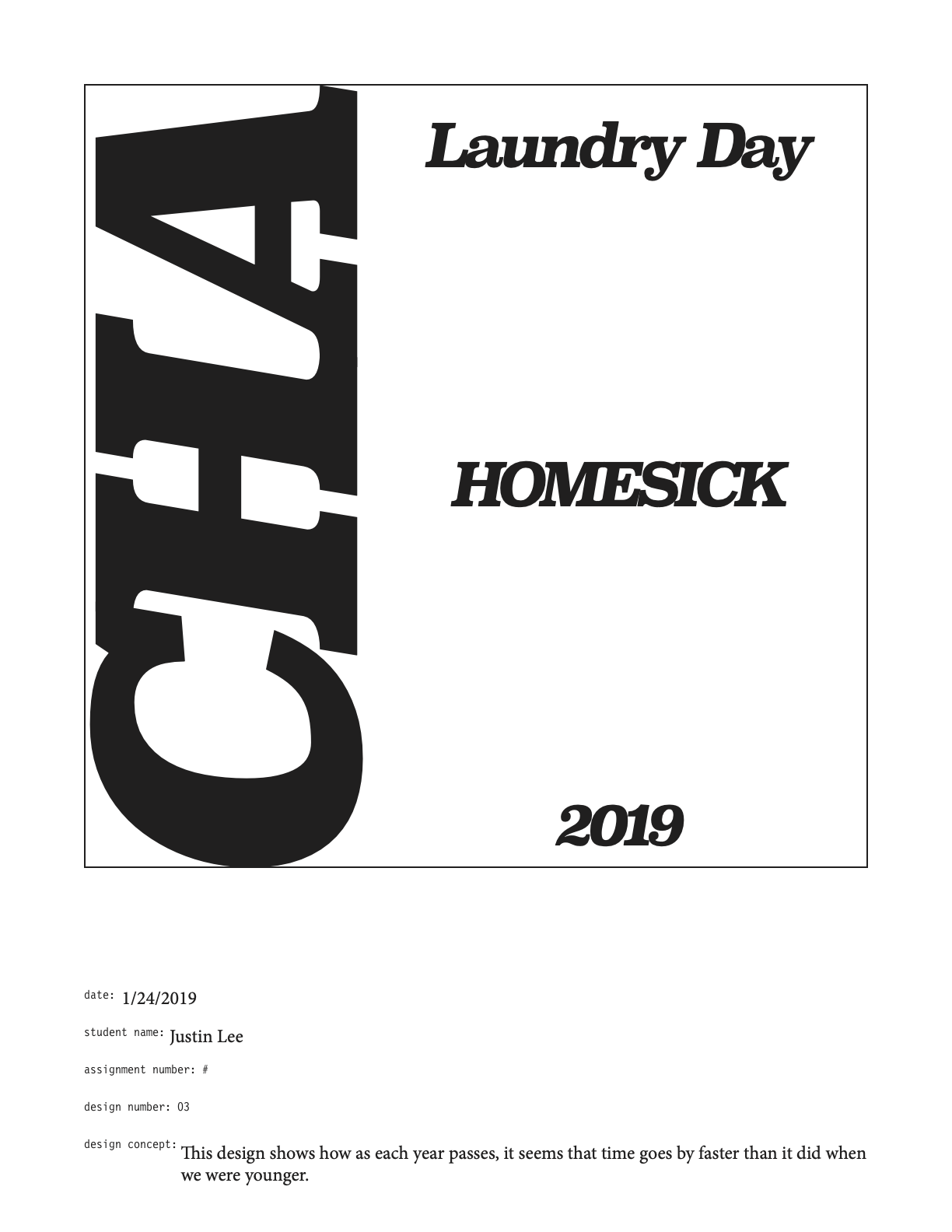
For chapter 4, I had complete range of font sizes and typefaces, meaning, I was able to use italics. With this, I incorporated italics into all my designs, trying to convey my song through new means. Through this, I was able to create more visibly appealing designs. My best design was either design number 1 or 5. Both designs were simple and explicitly expressed themes of my song. I would say that one of these designs is my favorite, but after changing my old design for number 3, I’d have to say that my favorite is my new design for number 3. To me, it is very unique and it creates something new. The text is cohesive, yet it transitions into something different. I’d even say it is even one of my top favorites in this whole book.
Chapter 5
For chapter 5, I was able to use any typeface and size. Also, I was able to combine different sized texts in each design. I think these designs were one of my most difficult ones. I was not certain on how to create unique designs using large and small texts. My best design was design number 5. The design was the most unique. The contrast between the large and small text creates a cohesive design that works together the best. Personally, my favorite would have to be design number 1 or 4. I love the contrast in design number 1 and structure. In design number 4, I love the pattern and the contrast between the texts.
Chapter 6
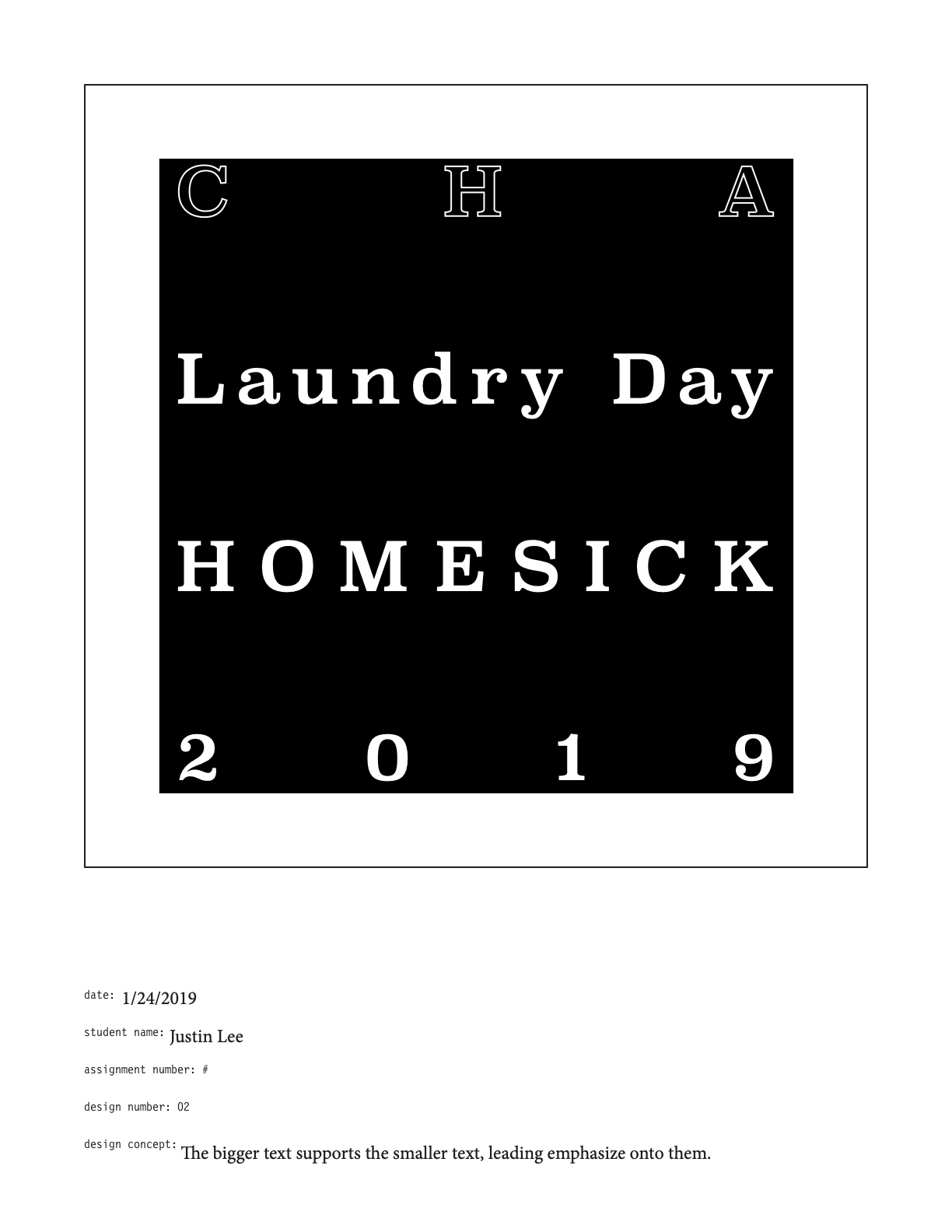
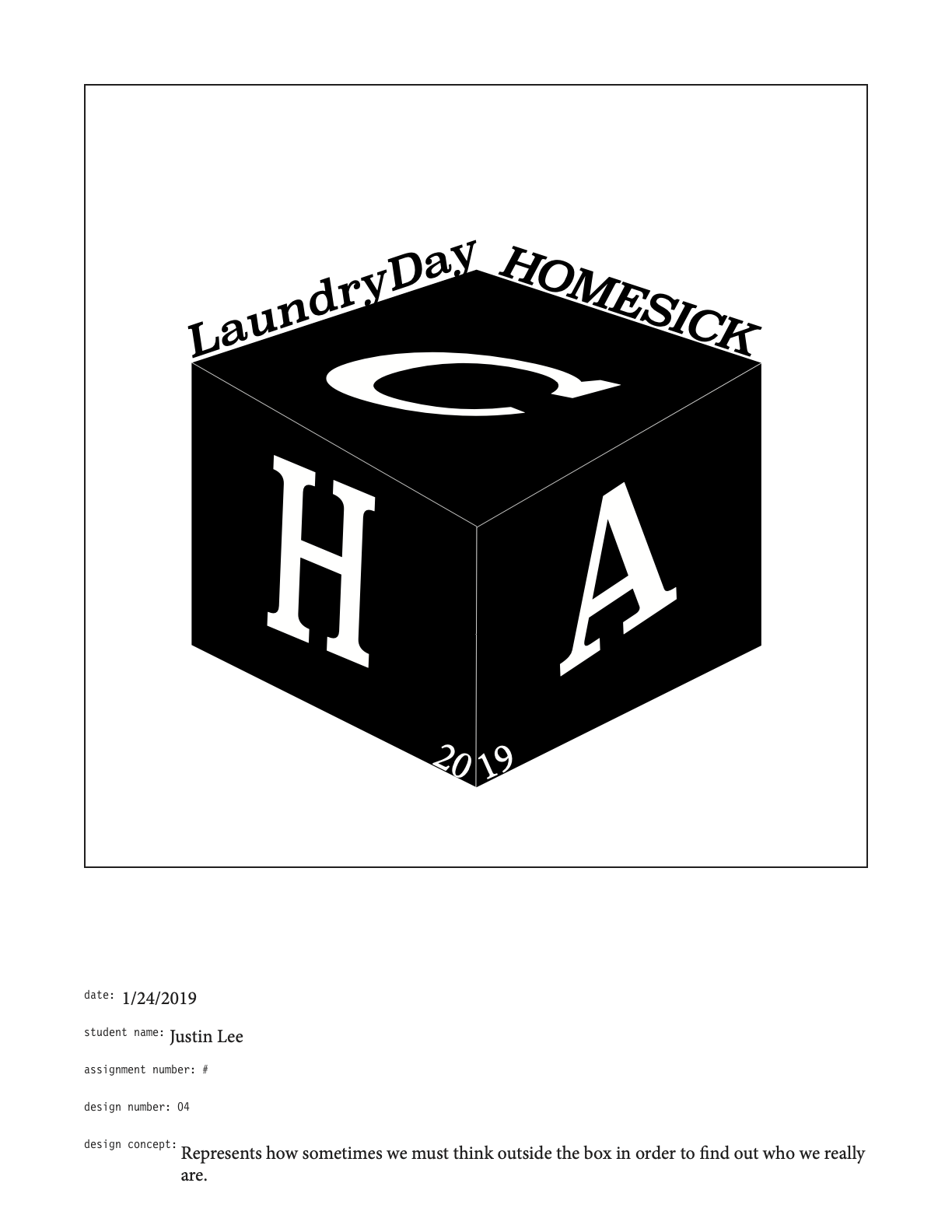
For chapter 6, I was able to use blocks and white type on black blocks. These designs were also one of the most difficult ones for me. My best design for this assignment was design number 1 or 3. The text and block in design 1 creates a boundary, wrapping them and creating a boxed design. My personal favorite is design number 3. I personally like the difference between the outlined and non-outlined white text. The text stays consistent and the overlapping letters gives it its aesthetic and personality.
Reflection
This was my first exposure to a true design process. I was able to fully experience enriching research and stimulating critique sessions. Even though my professor was sometimes a harsh critic, I felt energetic to receive his feedback and strive to create better designs. It was also my first time learning to create graphics that rely on typography that tell an emotional story. This project really pushed me to really consider how emotions in design affect audiences. Being able to adapt to that type of design has really shifted my design perspective and goals. Even with the restrictions posed onto me, I was able to find and explore creative ways to convey the exact emotions/story I wanted to tell, perhaps in an even better way.
For Fun
Animation
A couple years after the conclusion of the graphic novel, I was still affected by the song’s influence on me and how much I had grown from this specific project. With a growing passion in animation and 3D, I decided to make a 3D animation.